
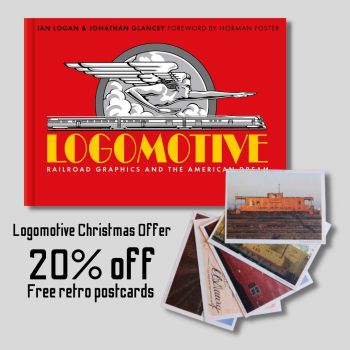
Rolling Along Bundle
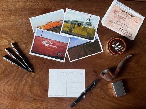
Train Lover’s Book and Retro Postcards
£28.00
Get rolling along with a copy of Ian Logan’s Logomotive and a pack of retro postcards. We’ve taken 20% off the price of the book, reducing it to £28 (£35.00), and thrown in five postcards worth £5.50, giving you a saving of £12.50. Keep the past alive this Christmas with the Rolling Along bundle.
Dispatched next day with Royal Mail 2nd Class
- Book Specifications:
- RRP: £35.00
- Format: 187 mm x 264 mm (7 2/5 x 10 2/5 in) landscape
- Pages: 272
- Weight: 1.3 kg (2 lb 14 oz)
- Pictures: 400 in colour
- Binding: Hardcover no jacket
- ISBN: 978-1-873329-50-4
- Publication: December 2020
- Postcard Specifications:
- RRP: £5.50 (free with bundle)
- Format: 106 mm x 142 mm (4 1/5 x 5 3/5 in )landscape
- Paper: 320 gsm Omnia Natural
- Weight: 31.25 g (1 oz)
- ISBN: 978-1-873329-66-5
- Publication: October 2022

How many people would be out photographing trains at 5.30 a.m. on Christmas Day? It takes an enthusiast to bring a subject alive. And this is very much alive. In between designing fabrics for Mary Quant and Jeff Banks, the indefatigable Ian Logan travelled across America, wandering into freight yards to record the Route of the Eagles, the Rebel Route, the Speedway to America’s Playground and more.
He has turned his passion for trains and logos into this celebratory book Logomotive, filled with the spoils of his journeys, and turned some of his favourite Kodachrome slides into postcards that bring alive those days.
For further details of the book, go to Logomotive, Railroad Graphics and the American Dream.
To see more of the cards, go to Vintage Railroad Postcards.
FOREWORD BY NORMAN FOSTER
PREFACE: Ian Logan on his love for US railroads
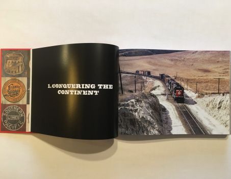
CHAPTER 1: CONQUERING THE CONTINENT
How railroads reached all corners of the continent; transcontinental lines; infrastructure and rolling stock.
Setting a Style
Overland Brands
Spirit of the Union
Romance of the Southwest
Mountain Mascot
A Mighty Good Road
Across the Divide
Southern Blues
Multiple Identities
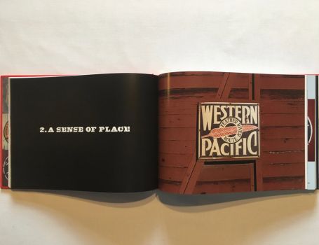
CHAPTER 2: A SENSE OF PLACE
Regional and local networks, and how they ran across one another’s lines.
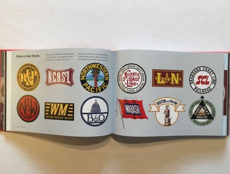
Pride in Their Roots
Maritime and Coastal
Chicago and the Lakes
Southern Connections
Commuter Lines
CHAPTER 3: ARRIVALS AND DEPARTURES
The city as railroad hub: stations, freight yards and transfers.
Architectural Logos
Station Design
Romanesque Revival
New Deal Deco
Spanish Mission Style
Carrying the Message
CHAPTER 4: SELLING THE DREAM
How the railroads built customer loyalty through advertising campaigns, slogans, nicknames and branding.
The Soft Sell
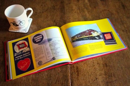
Nicknames
Slogans
Native American Imagery
Logo Evolution
Union Pacific
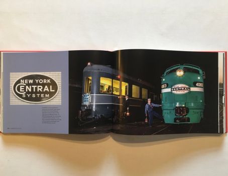
New York Central and Pennsylvania Railroads
The On-Board Experience
CHAPTER 5: STREAMLINE STYLE
The influence of European Modernism and sleek Art Deco styling; innovative railroad design from the 1930s to 1950s.
Shooting Stars
Eagles
Zephyrs
Hiawathas
The Aerotrain
Interiors
Art Deco Typography
On the Road
CHAPTER 6: PHOENIX ARISING
The switch from steam to diesel in the mid-20th century; the decline of passenger travel leading to amalgamations and Amtrak-operated services in the 1970s; the revival of restored steam locomotives on scenic routes.
Rust to Rust
Romance Revived
Heritage Line Logos
New Identities
Logo Revolution
New Haven
Canadian National
I Love G&W
Business Attire
Flying the Flag
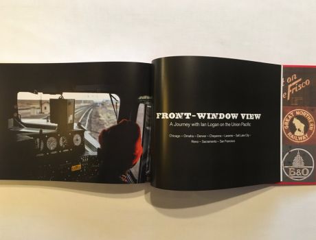
FRONT-WINDOW VIEW
A Journey with Ian Logan on the Union Pacific
Railroad Patches
A RAILROAD GLOSSARY
RAILROAD NAMES, ABBREVIATIONS AND NICKNAMES
SELECT BIBLIOGRAPHY
ACKNOWLEDGEMENTS
PICTURE CREDITS
INDEX
 Ian Logan was at the centre of the design revolution that marked the end of post-war austerity. He studied at the Central School of Art and Design in London (now Central St. Martin’s), and won a scholarship to the Konstfack, Stockholm’s University of Arts, Crafts and Design. In the early 1960s he joined JRM Design, a fabric print company set up by a group of Central graduates in an almost derelict building in London’s East End. Ian and his partners produced prints for up-and-coming fashion designers such as Mary Quant and Jeff Banks, and designed a tin tray with a Middle Eastern-inspired motif that became enormously successful, first in Carnaby Street and then all over the UK.
In the mid-1970s he set off in a new direction. Inspired by decorative Victorian tin boxes, he produced a range of tins for Harrods, Fortnum & Mason, Whittard of Chelsea and the National Trust. Commissions came from France, the Netherlands and the United States, for which he developed the Americana range featuring diners, gasoline stations and collectable cars. His money boxes in the form of the iconic red British telephone kiosk became known all over the world.

The journalist, author and broadcaster Jonathan Glancey is a trailblazing commentator on architecture and design, writing about buildings, cars, planes and trains with deep knowledge and infectious enthusiasm. The architecture and design editor of The Guardian from 1997 to 2012, he now reports on those topics for the Daily Telegraph, magazines and websites.

Norman Foster, Baron Foster of Thames Bank, Kt, OM, RA, is an internationally renowned architect whose buildings include the Hearst Headquarters in New York, the Museum of Fine Arts, Boston, the Swiss Re ‘Gherkin’ in London and the Reichstag dome in Berlin. His passion for railways goes back to childhood, when he would watch trains passing his home in Manchester. He has undertaken several major railroad projects, including the Florence High Speed Station in Italy and four stations for the Haramain High Speed Rail in Saudi Arabia.
FOREWORD BY NORMAN FOSTER
Logomotive touches on so many of my personal interests and in the ways they connect, particularly the age of streamlining, which ushered in the new era of lightweight, stainless steel post-steam expresses like the Burlington Zephyr built by Budd of Philadelphia and Union Pacific M10000. Budd also pressed body panels for the revolutionary Chrysler Airflow automobile of the same period. In promotional photo shoots, the Airflow appears alongside the M10000. Significantly, both are also visually linked to the Art Deco detailing of the New York Chrysler Building – all born in the early 1930s.
FROM CHAPTER 3: ARRIVALS AND DEPARTURES
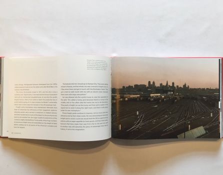
An epiphany of clanging bells, chiming whistles, baritone hooters and the percussive ministry of air-brake pumps announced the arrival of generations of trains at railroad stations across the United States. It was as if religious processions were coming to town. And, in a sense, they were. For the American railroad station or depot was, as medieval parish churches had been in Europe, the ritualistic hub around which life turned, especially in remote settlements.
As trains drew in, stations burst into life. Station wagons, horse powered before 1900, met passengers and their luggage bound for hotels. The station telegraph would be busy with reports on the line ahead and messages to and from passengers and their points of departure. Freight and baggage were manhandled in and out of boxcars and cabooses…
Station styles
By 1900, American passengers might find themselves boarding or alighting trains at stations designed in the guise of Romanesque abbey churches, Greek temples, imperial Roman baths, Gothic cathedrals, medieval cloth halls, Italianate palazzi, French chateaux, Black Forest gingerbread houses, Spanish missions and homespun farmsteads. Through this encyclopedia of styles, US railways expressed their values and ambitions. Station design could also be a reflection of local architectural character. Daniel Burnham’s mighty Union Station in Washington DC, opened in 1907, is an equal match for the Neoclassical civic temples and monuments lining the city’s Mall.Classical allusions
For many Americans, the architecture of ancient Greece and Rome embodied republican and democratic virtues. Commanding a vista of streets and avenues fanning out from Columbus Circle, Union Station is fronted by a giant reiteration of the Arch of Constantine. Through this Neo-Roman portal as many as 200,000 passengers a day have flocked into the Great Hall behind it, the imperious design of which is based on the Baths of Diocletian. ‘Make no little plans,’ Burnham said. ‘They have no magic to stir men’s blood.’FROM CHAPTER 1: CONQUERING THE CONTINENT
The 1881 Trademark Act made a significant visual impact on US railroads as draughtsmen got to work on new insignia. That same year the Chicago, Burlington & Quincy registered the first railroad trademark, a distinctive rectangle enclosing the legend ‘Burlington Route’ created by Daniel Lord of the pioneering Chicago advertising agency Lord & Thomas. Lord’s logo stayed firmly in place on Burlington Route trains until the Chicago, Burlington & Quincy merged with three other railroads in 1970 to form the Burlington Northern.
Choose a memorable logo
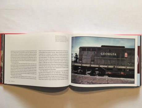
Also in 1881 the Union Pacific abandoned its antique-looking mountain elk symbol that might have belonged to any number of western railroads in favour of a distinctive shield design invented by its passenger agent Edward L. Lomax. With a number of subtle changes – among them the adoption of the colours of the US flag in 1888 and Futura-style lettering in the 1940s – this has stayed much the same ever since. Lomax said that it took him a year and a hundred sketches to find the exact right design.By 1883, the Pennsylvania Railroad had begun using its famous and long-lived keystone emblem, a visual reference to the state’s nickname The Keystone State. By this time, the Pennsy was not just the largest US railroad, but the world’s biggest corporation. The Baltimore & Ohio offered a white-on-blue image of the dome of the US Capitol entwined with the letters B and O encircled by the legend All Trains Run Via Washington.
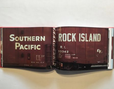
The Santa Fe’s cross-in-a-circle logo, allegedly created in 1880 by J. J. Byrne, the railway’s traffic manager, toying creatively with a pen and a silver dollar, was adopted in 1901, while the Great Northern’s Rocky Mountain goat trademark leapt from the mind of the railroad’s then Vice President W. P. Kenney in 1921. The Great Northern had played a key role in founding the Glacier National Park, where Rocky Mountain goats were a familiar sight. The beaver pelt trademark of the Rock Island – Chicago, Rock Island & Pacific Railroad – emerged in adverts in 1900 and had been refined into a well-known and enduring logo within five years.
Use your trademark
As early as 1890 Edward O. McCormick, general passenger agent of the Big Four system – the Cleveland, Cincinnati, Chicago & St. Louis Railway formed from a merger of four railroads in 1889 – gave a talk on railway advertising. ‘Have a trade mark and use it,’ he said. ‘Use it every-where . . . put it on your freight cars and plaster it wherever you can. People will unconsciously learn it, and will recognise it wherever it may be.’FROM CHAPTER 5: STREAMLINE STYLE
What these German, British and American trains had in common, whether steam or diesel, was a fresh look that manifested itself in bright new colour schemes, the latest in exterior styling and interior design, up-to-the-minute graphics, badges and logos, underpinned by decidedly modern advertising and marketing campaigns that helped sear their image into the popular imagination.
Gods and goddesses
The Burlington Zephyrs were the product of the research and imaginative skills of the aeronautical engineer Albert Dean, the advanced welding techniques of Edward Budd, the design flair of architects Paul Philippe Cret and John Harbeson and the vision of Burlington’s dynamic president, Ralph Budd. Wanting his streamliners to be the last word in contemporary railroad design, he decided their name had to begin with Z. By chance, Budd had been reading the Canterbury Tales. In the Prologue, Chaucer writes, ‘When Zephyr also has, with his sweet breath, Quickened again . . .’ The reference to the god of the west wind settled the matter. Racing with or against the west wind, the first two Burlington streamliners were known as the Train of the Gods and the Train of the Goddesses. Their passenger cars were named after the Roman deities Apollo, Jupiter, Mars, Ceres, Diana, and Venus, evoking notions of beauty, power, authority and speed.Luxury, speed and glamour
Until General Motors’ Electro-Motive Division got into its stride in the late 1930s, however, diesel could not produce anything approaching the horsepower of a big steam engine, restricting the number of cars that could be pulled and the on-board facilities provided. So the new streamline style was applied to the older technology, and it was a generation of mighty steam locomotives, modelled on sleek, wind-cheating lines, that powered the most glamorous streamliners. These included the Pennsylvania’s Broadway Limited, the Hiawathas of the Milwaukee Road, and the Southern Pacific’s Coast Daylight.The brightest star of all was surely the 1938 edition of the New York Central’s 20th Century Limited. A seamless fusion of the highest-quality engineering, design and styling, this lengthy and magnificently equipped two-tone grey streamliner was ‘cleanlined’ by the celebrated industrial artist Henry Dreyfuss from the striking Trojan Helmet nose cone of Paul Kiefer’s imperious Class J3a Hudson steam locomotives to every last detail of the cars. Lettering, logo, livery. Cutlery, napery, crockery. Cocktail glasses, matchboxes, concealed lighting and refined décor. In terms of design, no train has bettered this mile-a-minute overnight New York–Chicago express.


