Independent Publishers
COUNTRY WEBSITE:  UK websiteClick to visit USA website
Presented on a red background is a black and white railroad graphic of Zephyrus, winged god of the west wind, pointing to the future above a speeding, three-car diesel train. The title Logomotive follows in bold, yellow, Art Deco lettering.

For the Love of Logos

The designer Ian Logan fell in love with railroad logos on his first trip to America in 1968. The design critic Jonathan Glancey and the architect Norman Foster love logos, too, and all that goes with them including loco design, station design, colour, graphics and lifestyle. For the love of logos, they have written Logomotive.

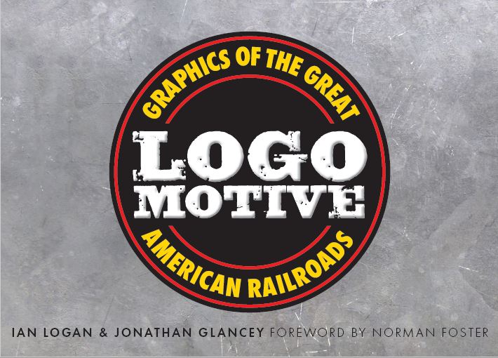
It seemed obvious to us that a book about logos should have a logo on the cover. But which? Logo design reached its apogee in the mid-century heyday of the American railroads. Unlike British railways, which were consolidated into the Big Four in 1923 and nationalized into one in 1948, American railroads continued to thrive as independent businesses until the 1970s, and each had its own logo or iterations of its logo. We had hundreds to choose from.

Looking for the right logo
When the 1881 Trademark Act came into force, railroads across America rushed to brand themselves in a memorable fashion. Union Pacific asked their passenger agent Edward L. Lomax to come up with a fresh design. He said he had to make hundreds of pencil sketches before he found just the right logo for the company, the famous shield that is still in use today.

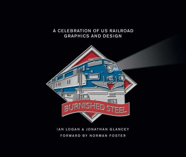
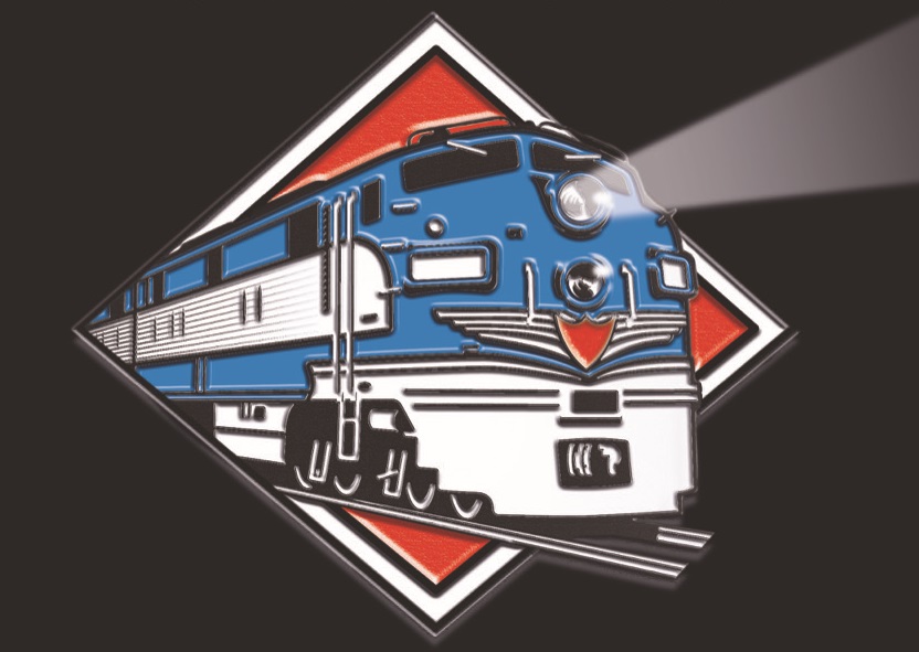
We have been through a similar process to find a find a logo for Logomotive. To start with, Ian Logan sketched a locomotive-and-lozenge graphic and asked an illustrator friend to work it up into a colour logo. Later they added a banner bearing the legend Burnished Steel, an early choice of title. Critics said these designs were more locos than logos.

In front of a logo with a locomotive and a projecting headlamp beam a scroll carries the working title Burnished Steel.
Ian Logan’s loco logo is embellished with a scroll bearing a working title.
In this colour artwork of a railroad logo designed by Ian Logan, a blue diesel-electric locomotive emerges from a red frame with a white border, light beaming from its headlamp.
Ian Logan sketched a loco-and-lozenge logo and had it made up in colour.

Pure graphic
Next we looked for a pure graphic such as the eagle of the Missouri Pacific or the Hiawatha of the Milwaukee Road, but feared we would offend the partisans of other railroads.

In the centre of a black cover the speed-lined eagle of the Missouri Pacific Railroad is picked out in red beneath the title Logomotive and the sub-title Graphics of the Great American Railroads.
The speed-lined eagle of the Missouri Pacific Railroad dominates this bold cover design.

Multi-logo approach
Rather than choose a single company’s emblem, we tried running many behind the title. Critics thought these designs were too dark, too masculine.

Beneath the one-line title Logomotive, set in a broken silvery font, the logos of numerous railroad companies are displayed in shadow on a dark blue background.
The logos of numerous companies are displayed beneath a one-line title.
Beneath the title Logomotive, set in a broken silvery font on two lines, the logos of numerous railroad companies are displayed in shadow on a dark blue background.
Here is a multi-logo approach with the title set in broken type on two lines.
Beneath the title Logomotive, set on two lines in an unbroken font, the logos of numerous railroad companies are displayed in shadow on a dark blue background.
This multi-logo design carries the title set on two lines in an unbroken font.

Ball and bar
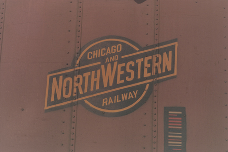
Next we explored the concept of creating a logo out of the book title itself and, for an authentic look, applying it to the side of a wagon. We roughed up some ideas based on the logo of the Chicago and North Western Railway. In the background, to capture the mood, would be some nicely rusting steel.  We considered having a cut-away in the cover board, to reveal the logos printed on the endpapers underneath.

The title and sub-title of Logomotive are made up into a ball-and-bar motif designed to look as if it is painted on the side of a rusty green boxcar, with a cut-away revealing the logos printed on the endpapers underneath.
The title and sub-title of the book are made up into a ball-and-bar motif.
The ball-and-bar logo of the Chicago & North Western Railway is painted in ochre on the side of a brown boxcar, punctuated by rows of rivets and accompanied by an early form of bar code.
This logo is known in railway circles as a ball-and-bar design.

We then prepared some more highly developed variations of the ball-and-bar logo, refining the typography and trying out different steel backgrounds, but the sales reps professed themselves underwhelmed by this whole approach.

The title Logomotive is incorporated in a ball-and-bar motif superimposed on a rusty Rock Island Lines boxcar, with the bar painted blue.
The ball-and-bar motif appears to be painted on a rusty Rock Island boxcar.
The title Logomotive is made up in a ball-and-bar motif designed to look as if painted on a rusty green boxcar.
Here the title and sub-title are designed to look as if painted on a green boxcar.
The title Logomotive is made up in a ball-and-bar motif superimposed on a burnished steel background framed with vertical lines of rivets.
Echoing iron-plate construction, the ball-and-bar is displayed with rows of rivets.
The title Logomotive is printed white on two lines in a circular graphic over a burnished steel background.
In this design the title graphic is circular and the background burnished steel.

Brighter
In search of a brighter look we produced some designs based on locomotive liveries. These templates are based loosely on the colourful nose-cone liveries of the Florida East Coast’s and other companies’ diesel locomotives. They had few takers.

A ball-and-bar motif bearing the title and sub-title occupies the centre of a colourful cover design for Logomotive using a nose-cone livery of bright yellow, red, blue and green.
This design repeats the ball-and-bar motif.
A circular title graphic occupies the centre of a colourful cover design for Logomotive using a nose-cone livery of bright yellow, red, blue and green.
Here the title is made into a circular graphic.

Try something else
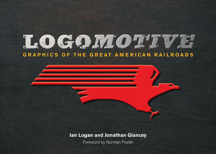
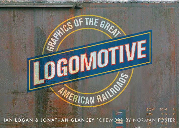
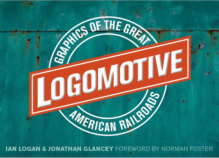
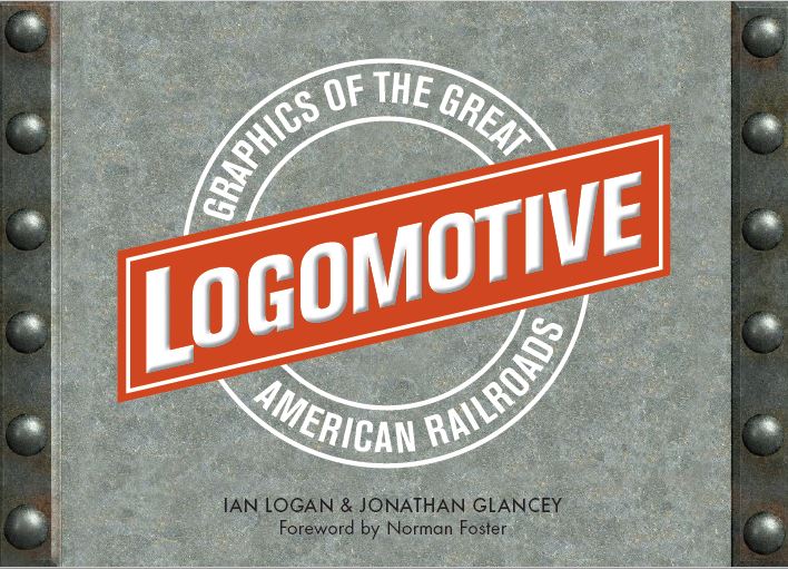
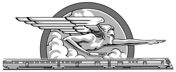
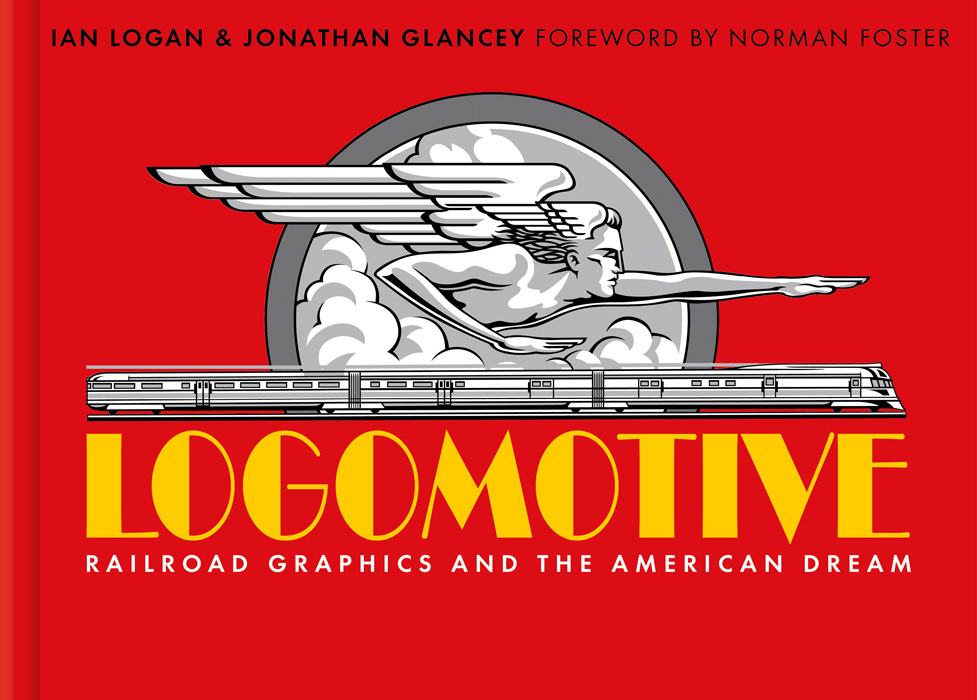
At this stage we concluded that what the designs had so far failed to get across was the romantic aspect of railroad travel and graphics, which reached its apogee in the golden age of the streamliners in the 1930s. The art director and designer of the book, Bernard Higton, then produced a striking design inspired by a 1934 promotional sketch for the Chicago, Burlington & Quincy Railroad. Bernard adapted the graphic and placed it on a strong red background with the title in an Art Deco font beneath it. This secured instant approval from both editors and reps.

Displayed on a red background is a 1934 black-and-white sketch of Zephyrus, god of the west wind, pointing to a streamlined future above a speeding, three-car diesel express, and beneath it is the title Logomotive printed in yellow in an Art Deco font.
Zephyrus, god of the west wind, points to a streamlined future above a speeding, three-car diesel express.

Upgrade needed
The original artwork is memorable and full of energy, but in technical skill it is somewhat lacking. Held in the archives of the Newberry Library in Chicago, it is variously described as a sketch or painting. On close examination it leaves much to be desired. It would never be good enough to use on the cover of Logomotive, so Bernard commissioned Neil Gower, an artist with a feel for the period, probably best known his Bill Bryson book covers, to redraw it. His brief was to produce a stronger, simpler design that retained an authentic Art Deco look.

In this first test piece, the artist has drawn a section of Zephyrus in a bold, Germanic style the Art Director thought too harsh.
In Test 1 Zephyrus is drawn in a bold, Germanic style the Art Director thought could look somewhat too brutal.
In this second test piece, the artist has redrawn a section of Zephyrus, softening the sharp angles, remodelling the profile and adding a tint to define the shading.
In Test 2 the artist has softened the sharp angles, remodelled the profile and added a tint to define the shading.

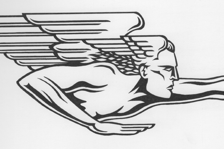
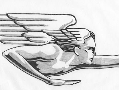
Neil Gower produced two test pieces to show the different styles he could adopt: sharper or softer. It was decided to go for something in between, and this is what you see on the cover.

In the final artwork the artist has followed a style mid-way between the two test pieces, adding the train and drawing Zephyrus in a bold, masculine style with extra shading.
The final artwork combines elements of both tests.

Logos galore
Logomotive: Railroad Graphics and the American Dream is now complete. If you’re into logos, branding, graphics, slogans, engineering design, billboards, station architecture, advertising, typography or period ephemera, from posters and postcards to badges, tickets and timetables, you could find this utterly absorbing. It is the story of a great industry in its heyday, when the Pennsylvania Railroad was the most valuable company in the world, told by a designer, a design critic and an architect who share a love of logos.

In this design by Bernard Higton the cover of Logomotive has a red background with a black-and-white graphic of Zephyrus, god of the west wind, in the centre. The graphic is drawn by Neil Gower.
On the cover of Logomotive the god of the west wind points to a streamlined future above a speeding Burlington Zephyr three-car, diesel express. Cover design by Bernard Higton, illustration by Neil Gower.

Go loco with logos
If you are carried away with  all this, you can get a copy of Logomotive straight from us in the UK and Europe or from our distributors in the US and Canada